
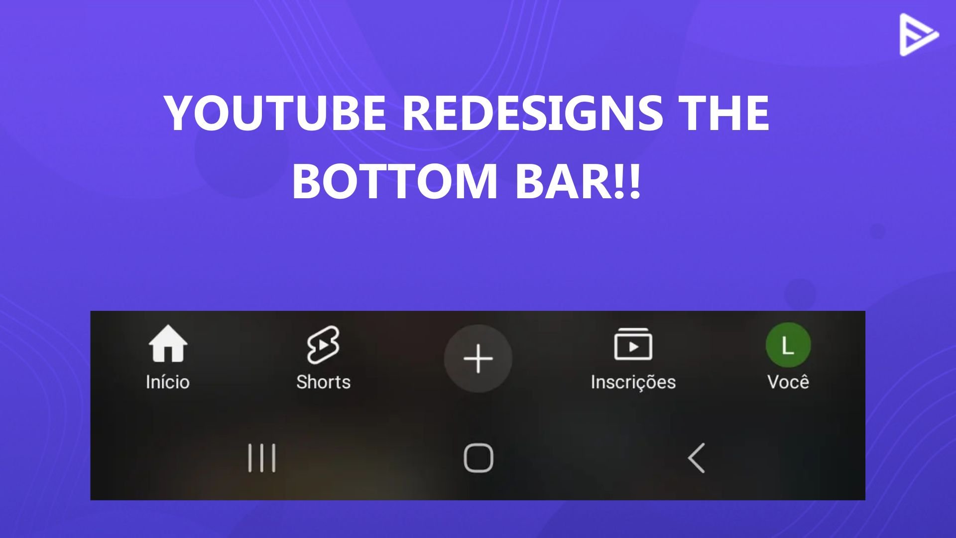
YouTube has once again made subtle tweaks to its interface, this time focusing on the bottom navigation bar for Android users. These changes are so minor that many might not even notice them, but they’re there! Let’s unveil them for you if you can’t see the changes.
YouTube Tweaks Look Of The Bottom Bar For Android Users
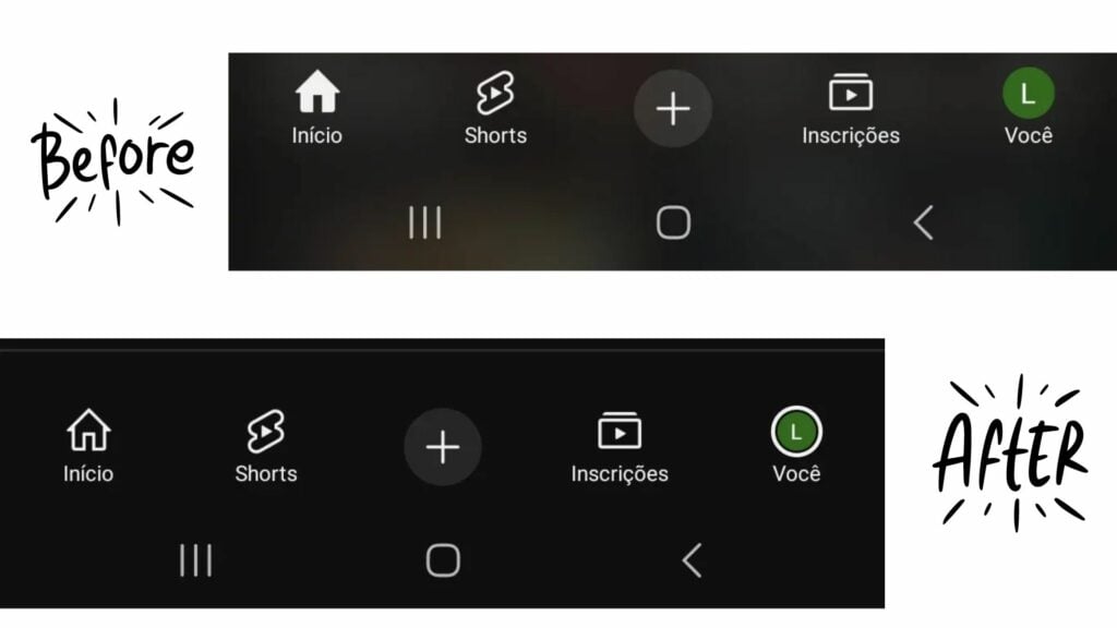
Currently being tested in a few countries, YouTube’s latest update brings a simpler, more streamlined look to the YouTube bottom bar. The home and subscription icons have been subtly redesigned, and the center “+” icon has lost its familiar white circular outline. Additionally, the background color of the bar has shifted from dark black to a soft, tinted brown, giving the interface a warmer, more ambient feel.
These changes aren’t yet visible on all devices, and YouTube seems to be gauging user reactions before a wider rollout. While the redesign might not be groundbreaking, it’s a small step towards a more refined experience.
The changes are currently exclusive to Android users, which might leave iOS users feeling a bit of FOMO. But hold on! YouTube loves to surprise its users. Just when you think you’re missing out, the update might appear on your screen when you least expect it!
Conclusion
YouTube has refreshed its bottom navigation bar by making the background translucent, allowing users to see the thumbnails of long videos beneath it. While the exact reason for this redesign isn’t clear, the benefits are already noticeable. Keep an eye out for the wider rollout. You might just spot this update on your device soon!