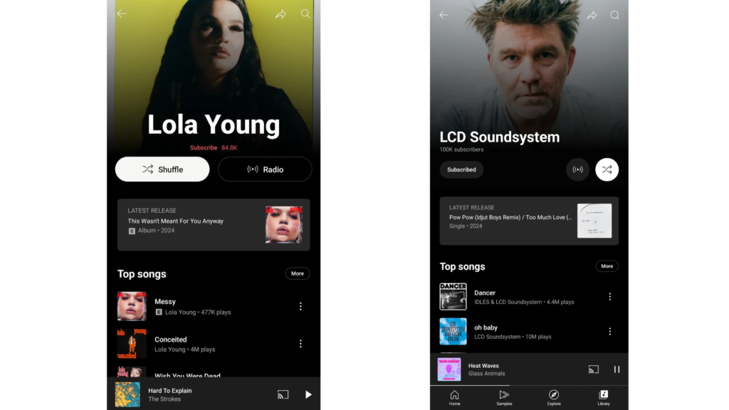
YouTube is changing all its products from time to time. Whether it be a new feature like a custom radio station or a revamped web page for premium users. Now, the video-sharing platform has introduced an artist page redesign that is slowly rolling out to users.
YouTube Music Introducing Redesign Artist Page For Android and iOS Users

As you know, YouTube has introduced a redesign of the artist page. It shifted the artist’s name a bit to the left, with the number of subscribers mentioned. You will also see the small subscribe button with a radio and shuffle feature in a circular shape. The placement of other features remains the same. You will see the artist’s latest release at the top of all songs and just below the artist’s name.
Unlike the YouTube application, this artist page redesign is available to all users. If you cannot see the changes, try updating your YouTube music application. The update is slowly being rolled out, so you may still not see the changes.
Conclusion
The artist page redesign update gives the page a softer and subtler appearance. It also makes the layout compact and easier to navigate. Typically, YouTube rolls out features and updates tailored to specific devices, but this time, the exciting new artist page redesign is available for both Android and iPhone users!


