
YouTube has seamlessly dropped new features and updates and sometimes played with the application’s interface. However, the latest tweak YouTube has made to the interface is getting highly chastised by users who have access to it. They noticed the difference in the YouTube website version and shared a picture of it on X and threads. It’s called a new YouTube UI update. Here’s everything!
New YouTube UI For Website Users
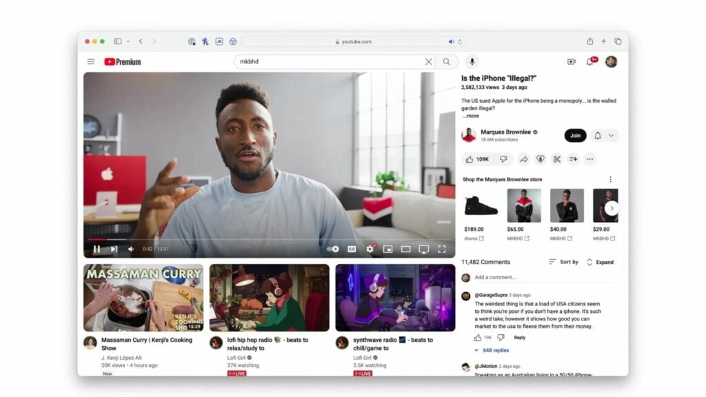
People who can access the latest update see the title and description of the video relocated on the right panel. The recommended videos that used to hang on the right panel are shifted to the video below. Seems like YouTube decided to interchange the position of both features.
As far as we know, the latest update is in the testing phase, and we may develop it completely if it gets a green signal, which seems unlikely. You may wonder why?
The percentage of people who liked the YouTube UI interface is lower than that of haters. One user added a poll to the threads asking who loves the feature and who does not. The poll has 75% of votes for “Trash” and 25% for “love it.” The other user has gone as far as to say that the new YouTube UI might be the most hideous update he has seen in a while.
YouTube, moving forward with this update, has very few chances. But if you want to get your hands on it, try updating your browser to get the update.
Conclusion
The new YouTube UI reverses the position of the title and description to video recommendation. Users who can see the changes in their website interface YouTube hate the new look and share their feedback on social media platforms like X and Threads. As YouTube’s focal point has been user satisfaction, seeing their feedback may block the complete development of the update. Besides this, YouTube Music has introduced a new gradient look to its interface.