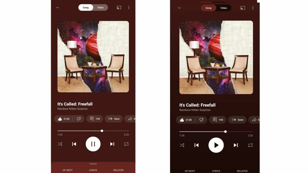
YouTube has recently rolled out the new “Now Playing” gradient design to give the page a tweaked interface. This is one of the minor changes made to the application, but it appears to bring immense change in the future as YouTube has made numerous changes in its interface and design. Let’s dive deeper into the YouTube Music Now Playing update to understand what more it unrolls.
YouTube Music Introduces Redesigned Now Playing Background To Gradient

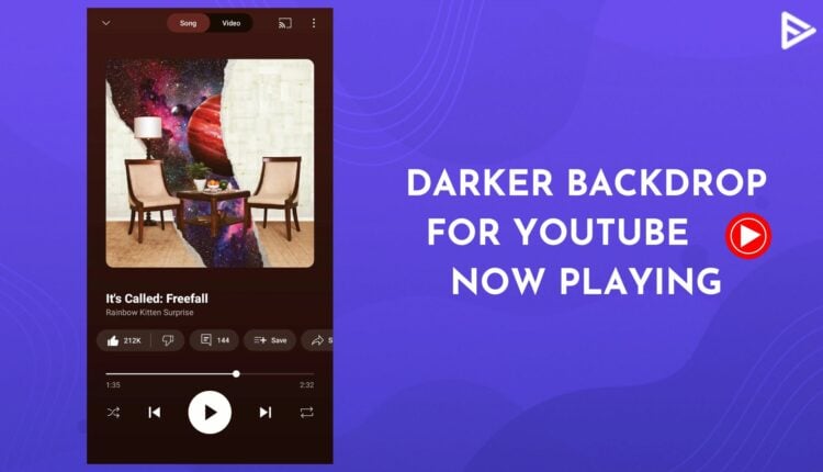
If you noticed the differences in the Now playing interface on YT Music, that’s what the new update is about. The platform has redesigned the “Now Playing” set into a gradient design that gradually fades and gives a darker shade to the background from top to bottom. The YouTube Music Now playing update is currently available only on Android devices. The change hasn’t appeared to any iOS users yet. However, not all Android users see the change since it still needs to be completely rolled out. If you do not see the changes on your app yet, you must wait for the feature to be wholly launched or ensure that you use the latest version of YouTube Music to get the entire color progression.
YouTube Music Now Playing revamp update has given the application a darker and more appealing appearance. It’s a selectively minor change to the interface for now, but more such updates are expected as the platform has been revamping the user interface for the past few months. This includes redesigning the overflow menu and the YT music library tab.
The darker gradient shade makes the existing features like play, pause, next, shuffle, queue, and others more visible and accessible. Besides the gradient backdrop, you need to swipe up from the bottom to access your queue, as the platform has removed the pull tab indicator. In addition to the YouTube Music Now Playing update, the layout of the “up next,” “lyrics,” and “related” has also changed, and unlike before, it blends with the background.

Conclusion
There’s no fuss about the YouTube Now Playing gradient redesign update yet. Because this change is related to the backdrop of the Now Playing page, which is hardly visible. However, its gloomy appearance makes all the features apparent and noticeable. If you have already updated the YT music application to the latest version and still don’t see the new user interface, you can try to “Force stop” the platform under the settings.
To maximize engagement, you can connect with promotion services like VeeFly to promote YouTube videos. You can also buy YouTube subscribers and views legitimately.
You can look for natural ways to grow your YouTube channel, like creating compelling titles and descriptions. Our tools, like the title generator on YouTube and the YouTube description generator, will help you achieve the goal.


