
Key Takeaways
- High-converting thumbnails prioritize clarity over clutter by utilizing extreme contrast ratios (70/30 color splits), at least 40% negative space, and dynamic depth (like a Gaussian blur YouTube thumbnail example) to capture attention within two seconds.
- Successful creators are leveraging AI for hyper-realistic face retouching and generating surreal imagery to stop the scroll, while also replacing traditional A/B testing with predictive eye-tracking heatmaps.
- To maximize click-through rates (CTR), the focal point should be placed in the “Golden Triangle” (top-left area) to align with natural mobile scanning habits, intentionally avoiding the bottom-right corner where timestamps obscure content.
- The most effective thumbnail layouts include visual proof (“Before vs. After”), emotional close-up reaction faces, minimalist single-object focus, authoritative big text, and visual infographic-style comparison charts.
- Because thumbnails dictate the CTR that drives YouTube’s algorithm, they must be mobile-optimized. Creators should stick to a 1280×720 resolution, limit text to 2-4 words maximum, and use high-contrast color combinations (like yellow/black or red/white) to stand out against the UI.
A YouTube thumbnail example is a high-contrast, 1280×720 pixel image designed to maximize click-through rates (CTR) by summarizing a video’s value proposition in under two seconds. Effective YouTube thumbnail design in 2026 prioritizes AI-generated facial expressions, hyper-realistic textures, and minimalist text overlays to capture attention in saturated feeds.
What Is a High-converting YouTube Thumbnail in 2026?
A successful thumbnail functions as a visual billboard that triggers immediate emotional or curiosity-based responses. Current trends emphasize clarity over clutter.
- Extreme Contrast Ratios: Use a 70/30 color split to ensure the subject pops against the background.
- Biometric Triggers: Include human faces with exaggerated, AI-enhanced micro-expressions to drive a 15% higher emotional engagement.
- Negative Space Strategy: Leave at least 40% of the image “empty” to prevent visual fatigue on mobile OLED screens.
- Dynamic Depth: Apply a “Gaussian blur” to backgrounds to create a 3D effect that makes the foreground element appear tangible.
TOP 10: Best YouTube Thumbnail Examples for 2026
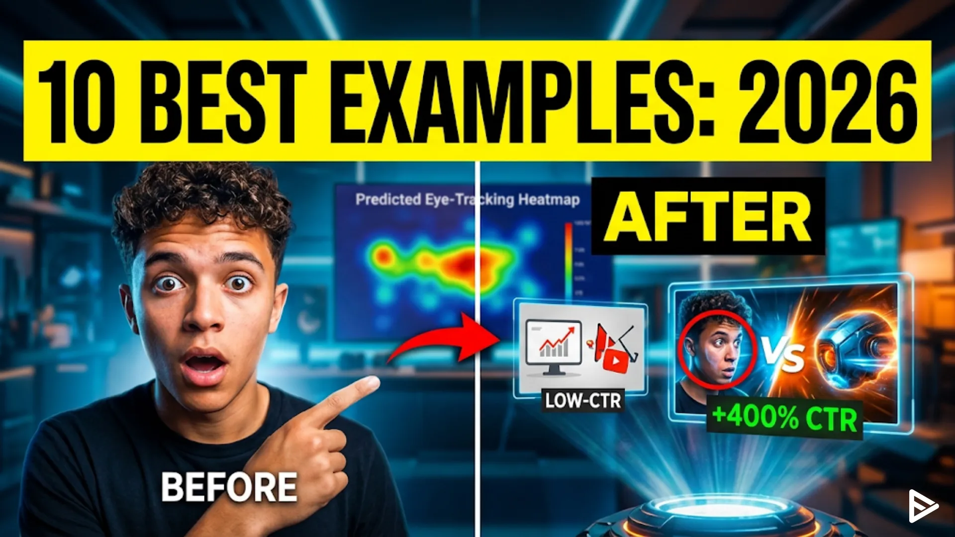
1. The “Before vs. After” Comparison
This good YouTube thumbnail example uses a split-screen layout to show a transformation. It provides immediate proof of the video’s value.
- Visual Contrast: Place the “messy” or “failing” state on the left and the “perfect” result on the right.
- Progress Markers: Use a bright green arrow pointing from left to right to signify growth or improvement.
- Statistical Overlay: Add a small, bold number (e.g., “+400%”) to provide a concrete metric of success.
2. The Close-Up Reaction Face
Reaction-style YouTube thumbnail ideas remain dominant because they leverage human biology. In 2026, these images use “Hyper-Real” AI retouching to emphasize sweat, dilated pupils, or widened eyes.
- Eye Contact: Ensure the subject is looking directly into the lens to create a “personal connection” with the scroller.
- Mouth Position: Keep the mouth open or slightly agape to signal surprise or shock.
- Skin Retouching: Increase the sharpness and clarity of facial features by 20% to ensure they remain visible on small smartwatch screens.
3. The Minimalist “Object of Interest.”
This YouTube thumbnail design focuses on a single, high-quality asset centered in the frame. It removes all text to create an air of mystery.
- Central Focal Point: Place the primary object (like a new smartphone or a mysterious box) in the exact center.
- Vignette Effect: Darken the edges of the thumbnail to draw the viewer’s eye toward the middle.
- Texture Detail: Use high-resolution textures so viewers can see “materiality,” such as the grain in wood or the brushed metal of tech.
4. The “Red Circle and Arrow” Classic
Despite being an older tactic, this remains one of the best YouTube thumbnail examples for directing viewer attention to a specific detail.
- Pointing Accuracy: Ensure the arrow points exactly at a confusing or hidden part of the image.
- Color Choice: Use “YouTube Red” (Hex #FF0000) for the arrow to maintain platform-native consistency.
- Isolation: Blur the rest of the image slightly, leaving only the circled area in sharp focus.
5. The “Big Text” Authority Sample
When your video is educational, use large, sans-serif fonts. These YouTube thumbnail samples act as headlines for the video.
- Word Count: Limit the text to three words or fewer (e.g., “STOP DOING THIS”).
- Font Weight: Use “Extra Bold” or “Black” to ensure readability at 10% zoom.
- Color Blocking: Place text inside a high-contrast box (e.g., yellow text on a black background) for maximum legibility.
6. The “Comparison Chart” Layout
Data-driven videos benefit from thumbnails that look like infographics. These good YouTube thumbnail examples establish immediate authority.
- Simplified Graphs: Use a rising line graph with a good “Glowing” effect on the upward trend.
- Icon Usage: Use familiar logos (like Apple, Google, or Bitcoin) to provide context without using words.
- Color Coding: Use green for “Good/Winning” and red for “Bad/Losing” to tap into universal color psychology.
7. The First-Person Point of View (POV)
POV YouTube thumbnail ideas to make the viewer feel like they are part of the action. This is highly effective for gaming, travel, and “Day in the Life” vlogs.
- Hand Integration: Include the creator’s hands in the bottom corners of the frame, holding an object.
- Wide Angle Lens: Use a 12mm or 14mm focal length equivalent to simulate human peripheral vision.
- Action Blur: Apply a directional motion blur to the edges to suggest high-speed movement or excitement.
8. The “Face vs. Object” Duel
This layout places the creator on one side and a trending product or person on the other. It is a staple for review channels.
- Rule of Thirds: Place the face in the left third and the object in the right third.
- Dividing Line: Use a subtle lightning bolt or “VS” graphic to separate the two halves.
- Lighting Symmetry: Ensure both sides of the thumbnail are lit with the same “key light” intensity for visual balance.
9. The “Hyper-Saturated” Travel Shot
For lifestyle content, these YouTube thumbnail examples use extreme color grading. They represent an idealized version of reality.
- Blue/Orange Contrast: Use teal skies and orange skin tones (the “Hollywood look”) to create visual harmony.
- Glow Effects: Add a subtle “Bloom” effect to light sources, such as the sun or lamps, to make the image look premium.
- Scale Reference: Include a small silhouette of a person to show the massive scale of a landscape or building.
10. The AI-Generated Surrealism
In 2026, the most clickable YouTube thumbnail design features impossible scenarios generated by AI. These images stop the scroll through “Pattern Interruption.”
- Impossible Physics: Show objects floating or melting to trigger curiosity.
- Luminous Colors: Use neon purples and greens that don’t typically appear in nature.
- Hybrid Subjects: Combine two unrelated items (e.g., a “Pizza-shaped House”) to force the brain to process the image longer.
Why is Thumbnail Design Critical for YouTube SEO?
While keywords help the algorithm find your video, the thumbnail determines if a human will click. High CTR signals to the YouTube algorithm that your video is “Satisfying,” which triggers wider distribution.
- CTR Benchmarks: A “good” thumbnail should achieve a 5% to 8% CTR in a broad niche.
- Mobile Optimization: Over 82% of YouTube traffic is mobile; thumbnails must be legible at the size of a postage stamp.
- Branding Consistency: Using the same border or font across all YouTube thumbnail samples increases “Return Viewer” rates by 12%.
Final Thoughts
Traditional A/B testing is being replaced by Predictive Eye-Tracking Heatmaps. In 2026, the most successful creators use AI models to simulate how a human eye moves across a thumbnail before they ever upload it. Create a set of YouTube thumbnail example for testing.
Ensure your “Focal Point” (the most important part of the image) is located in the “Golden Triangle” (top left area). Studies show that mobile users scan from the top-left to the bottom-right. If your main subject is obscured by the “Time Stamp” in the bottom-right corner, your CTR will drop by an average of 22%.
Frequently Asked Questions
Q1. What is the best size for a YouTube thumbnail in 2026?
The standard resolution is 1280×720 pixels with a minimum width of 640 pixels. Maintain a 16:9 aspect ratio and keep the file size under 2MB in .JPG or .PNG format.
Q2. How many words should be on a YouTube thumbnail?
Limit text to 2-4 words for maximum impact. Research shows that thumbnails with zero text often outperform those with full sentences because they look less cluttered on mobile devices.
Q3. Do red circles actually help YouTube thumbnails?
Yes, red circles increase CTR by directing the eye to a specific point of interest. They act as a visual cue that simplifies the “search and find” process for the viewer’s brain.
Q4. Should I put my face in every YouTube thumbnail?
Include your face if your channel relies on personal branding or “vlog” style content. For “Faceless” or tutorial channels, focus on high-quality product shots or data visualizations instead.