YouTube Music app now has another redesign update. In an attempt to make the app less cluttered, the app is now testing for the overflow menu redesign that makes the overflowing menu a little compact. Some of the YouTube Music iOS app users might have seen this new change, as it is out for testing.
However, the overflow menu redesign does not bring out a significant difference in how the app works or looks. But here’s everything that has changed.
YouTube Music Overflow Menu Redesign: What Changed?

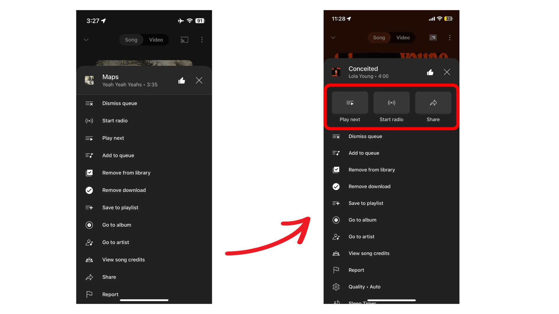
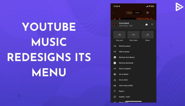
YouTube Music on iOS changed its look a few months back by introducing a new permanent mini player at the bottom of the home screen of the app. And now again, it is back with another redesign; that is, the overflow menu getting shorter. The overflow menu before had lots of buttons and stretched really long. So, for users to access things easily, it now has three large buttons at the top; Play Next, Start Radio, and Share.
The first two were already on the top of the list on the old menu. While the share option was at the bottom. So, this is the app’s attempt to make it easier for the user to perform the most interacted actions easily. To access this menu, you have to tap on the Now Playing page. The overflow menu redesign makes it appear a bit shorter. Users still have to scroll down to see all the options available in the menu. So, in the end, there is not much of a difference when compared.
YouTube Music has been in the news a lot lately since the platform is trying its best to have an edge over all its competitors. With the rise in all other music listening apps like Spotify, Amazon Music, and others, this platform is also trying to upscale itself. The platform is the official Google partner for podcasts. With the launch of Podcasts to the YouTube Music app, the platform is trying to bring more listeners to it. Recently, the app has also introduced more mood filters or tabs, making it easy for users to find songs that match the mood.
If you’re a Premium YouTube Music user, then you can now also enable Smart downloads. So now users can hook on to the latest episode from their favorite podcast any time they want, offline.
Conclusion
With that all being said, it’s important to note that YouTube Music’s latest update of overflow menu redesign is another attempt at making the app more user-friendly. Since the app was not a hit as YouTube itself, with all these new subtle improvements, it’s trying to make itself stand out better.
If you are an artist on YouTube and want your videos to be visible to your audience, you can also promote video on YouTube. Multiple promotion services like VeeFly help you promote your music videos and songs on different platforms.


