Youtube’s video player for android and iOS is all set to enrobe with a fresh new look. (curious enough?)
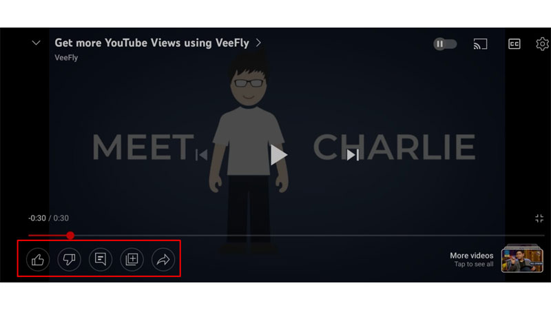
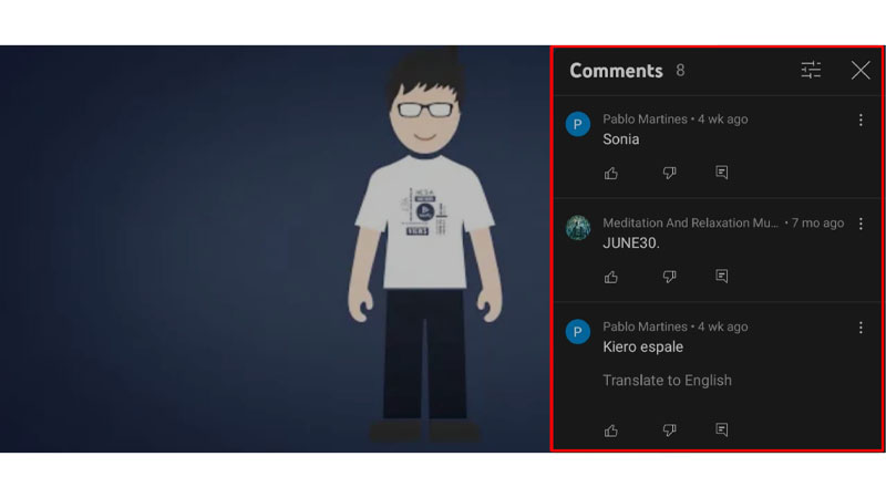
Reportedly, the new design – that is primarily aiming towards revamping the landscape view of the YouTube app will make it much easier to like or dislike a video (as if it matters anymore?), view comments, and share what you’re watching.
Key differences between the new YouTube’s Video Player and the old one:
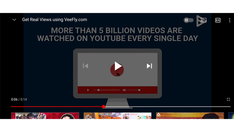
The current (older) version of YouTube’s video player (both for Android and iOS) is kinda rugged. It’s true! We didn’t quite pay attention to it (until now) Thanks to the modern, lucrative design of the new video player, we finally know what we were missing out on all this while.
Focused on improving productivity | Never miss to like/dislike any video
YouTube’s new video player is tilted more towards ‘the productive side of things.’ (kinda ironic, given that it’s coming from the same streaming service that removed dislikes a while ago)
With this new update, YT is (at least trying to ensure) that no video on its platform witnesses the plight of having zero likes on its platform.
Let’s be honest. When it comes to watching videos on the mobile app, we often toggle the landscape view. Once done watching the video, we instantly skip to the next one – without pressing the like or dislike button (creator sobs in the corner!)
Now having the ability to quickly drop a like/dislike (straight from the panel) will only make it convenient for you to interact with the video. (happy tears for the creator yes!)


Easier toggling for recommended videos
Apart from having a quick access panel to drop likes, dislikes and comments, YouTube’s video player for iOS (and Android, of course), will make it more convenient for the user to look for other recommended videos.
Save videos on the go | Seamless access to ‘Watch Later’ and ‘Playlists’
If you’re also one of those (like me) who “binge-save” most videos to watch later or add them to your playlist, we have good news for you. YouTube’s new video player is going to make this operation quite simple and effortless.
Where previously you had to hit that little “zoom-out” button on the bottom right – then scroll down to the panel and look for the save button, now all you’ve got to do is tap the save button that’s readily available on the screen itself! How cool!
One tap Share
If there was ever a better time to share with your loved ones all your favourite YouTube videos, it’s now. YT’s new video player (for Android and iOS) makes it super efficient to share videos on the move.
Right beside the Like, Dislike and Comment buttons (after the update available in the UI itself), you will now also see an option to share your videos as well.

Conclusion
While YouTube’s new video player brings all things useful, it is important to note that these changes will break open only into the landscape view of the YT mobile app; the Portrait mode will essentially be the same (both for Android and iOS)
We’re sure you’re going to enjoy this new update as much as we do.
Although there’s no tentative release date as to when the update will roll out officially, we can assure you that when it does, you’ll hear from us! (It’ll be a global release, chill out!)
If you have any questions, feel free to drop them in the comments below.


