Do you know how vital your YouTube profile picture can be in growing your channel on the platform? Of course, you can start by choosing a niche and uploading high-quality video content. However, creating a unique and appealing YouTube profile picture can give you a big advantage since it represents your channel’s identity. In this guide, you will learn about the importance of a YouTube channel profile picture size and how you can use the perfect YouTube size to make a powerful impact on your viewers.
Why is a YouTube Profile Picture Important?
Yes, similar to Facebook Messenger, WhatsApp, or Instagram Direct, it is essential to have a YouTube profile picture for your YouTube channel. It is also known as a “channel icon” or “YouTube Avatar.” A detailed and well-crafted image according to the YouTube profile image size can make it easy for the audience to recognize your channel.
Often, a YouTube profile picture is confused with a YouTube banner or YouTube channel art, which is only visible once the user clicks to visit your channel. Depending on your niche and branding, you could use your personal image or create a brand logo, icons, and graphics as your profile picture for your channel. If you need help, there are many YouTube profile picture maker tools available. The ideal size of YouTube profile picture act as an emblem that can be used everywhere from social media to merchandise.
What Is The Ideal YouTube Profile Picture Size?
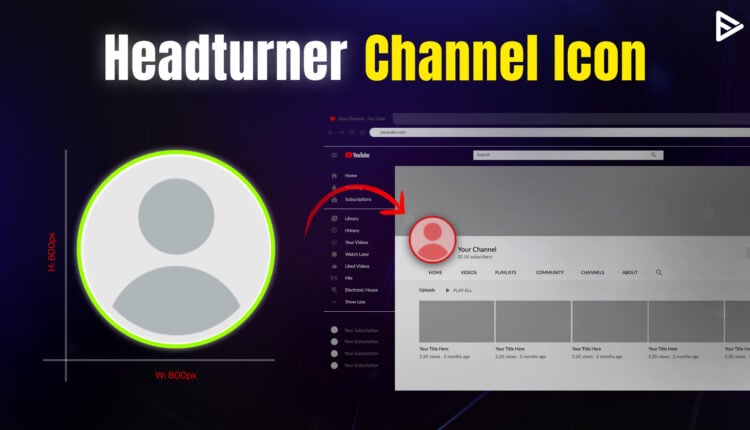
The ideal YouTube profile size is 800 x 800 pixels. It is displayed as a circle rather than a square. The aspect ratio is 1:1. The maximum file size for uploading the appropriate YouTube profile pic is 2 MB. The supported file formats are JPG, PNG, BMP, or GIF. A YouTube profile picture is a tiny thumbnail on all your videos next to your YouTube channel name and next to comments.
Your YT profile picture is also known as your channel icon or avatar. Make sure the corners of your channel’s profile picture aren’t cut, and if there is any text in the picture, it is visible in the YouTube pic size. Note that your YouTube profile picture is different from the YT banner. It is recommended to use the YouTube profile picture maker as it has pre-built templates that work best for yt profile pic size.
YouTube Profile Picture Best Practices
An attention-grabbing profile picture that fits the YouTube icon size can help you attract more YouTube subscribers. Here are a few tips to help you make a lasting impact with your YouTube channel icon.
1. The circular channel Icon
When choosing a profile picture, keep the circular shape in mind. Ensure the circular crop does not cut off any essential design elements. To avoid this, ensure your key elements, such as logos or faces, are centered. Avoid placing details near the edges, and preview your design on multiple devices and in numerous dimensions.
2. Same profile picture across all platforms
Staying consistent with your profile picture across all your social media channels makes it easy for your viewers to identify your channel. Use the same YouTube profile picture size ratio across all channels. Be it Instagram, Facebook, Twitter, etc. It builds a unique brand image and gives your channel more visibility.
3. Few texts in the channel Icon
Remember, the circular format gives you limited space. Be creative enough to present your channel voice without adding too much text in the logo. If there are too many words in your picture, it will be difficult for users to read, especially on mobile devices. Keep your YouTube profile logo size minimal and clutter-free to attract the maximum viewers.
4. Synchronize channel banner with channel Icon
The YouTube channel homepage should align with your channel icon. This will make the channel theme look consistent, and the visual factor will also be strong. You can experiment with the color theme or logo to match your YouTube profile picture with your channel art.
You can also present the same brand image on other platforms. The overall visual strategy will spark curiosity among your target viewers and encourage them to learn more about your content.
5. Use whitespace to stand out
Cluttered designs can look messy. The primary motive for creating a profile picture is to make it memorable, so viewers can easily resonate with it. Modern branding uses whitespaces to enhance readability and maintain focus. Try limiting the number of elements or colors to avoid visual overload.
Whitespace draws attention to your primary subject, such as your logo or a key image. A well-balanced design with sufficient whitespace appears polished and is recognizable even at a glance.
Steps To Upload Profile Picture On YouTube
Follow these simple steps to upload your Profile Picture on YouTube:

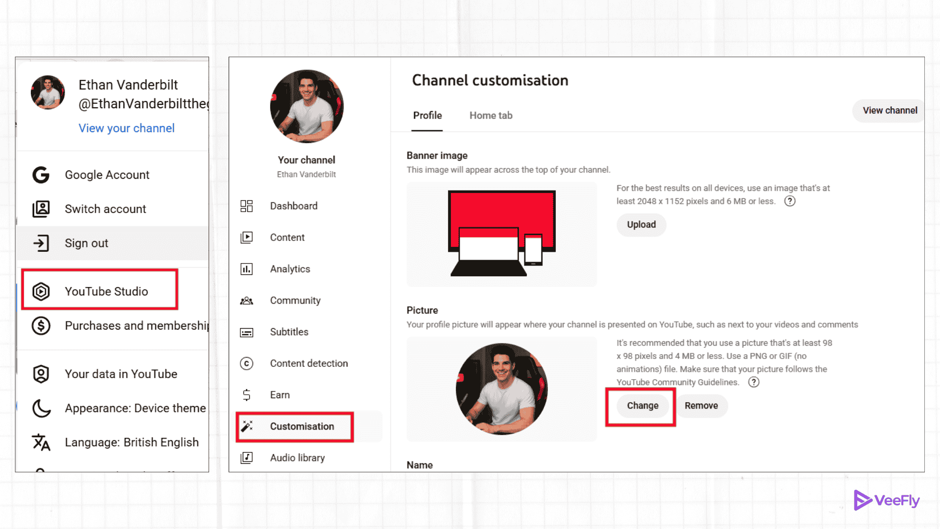
1. Log in to YouTube.com
2. On the upper right side, select the ‘user icon.‘
3. Now click on YouTube Studio.
4. Once you log in to YouTube Studio, select ‘customization‘ on your left menu bar.
5. There will be four options available ‘layout,’ ‘branding,’ and ‘basic info.’ Out of these options, select ‘Branding.’
6. It allows you to add your profile picture, YouTube channel banner, and the video mark on the YouTube video.
7. Since you want to upload your profile picture on YT, you need to click on ‘upload‘ under the Profile Picture tab.
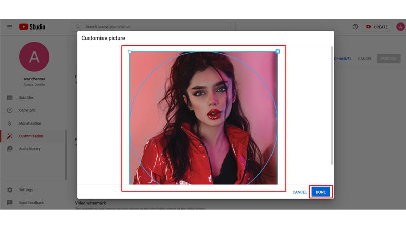
8. Select the image that you want to use as your YT profile picture
9. Adjust the image appropriately and click on ‘Done.‘ Done… you have successfully uploaded your profile picture on YouTube.
How to Change YouTube Profile Picture
You can change the YouTube profile picture with just a few simple steps.
Step 1. Log in to your YouTube channel.
Step 2. Go to the profile picture and select “View your channel” from the drop-down menu.
Step 3. Navigate to the “Customize channel“.
Step 4. Click “Branding” under channel customization.
You will get three options: Profile Picture, Banner Image, and Video Watermark. You can add or remove images from those options. The perfect dimensions for each one are Profile picture( 800 x 800px), banner image(2560 x 1440 px or 1235 x 338 px), and Video watermark(150 x 150px) under 1mb.
Step 5. Click “Change” to set image.
Step 6. Upload the file, adjust the Image, and click done.
Step 7. Click the blue publish button in the top right corner to save changes.
Ideas for YouTube Profile Picture
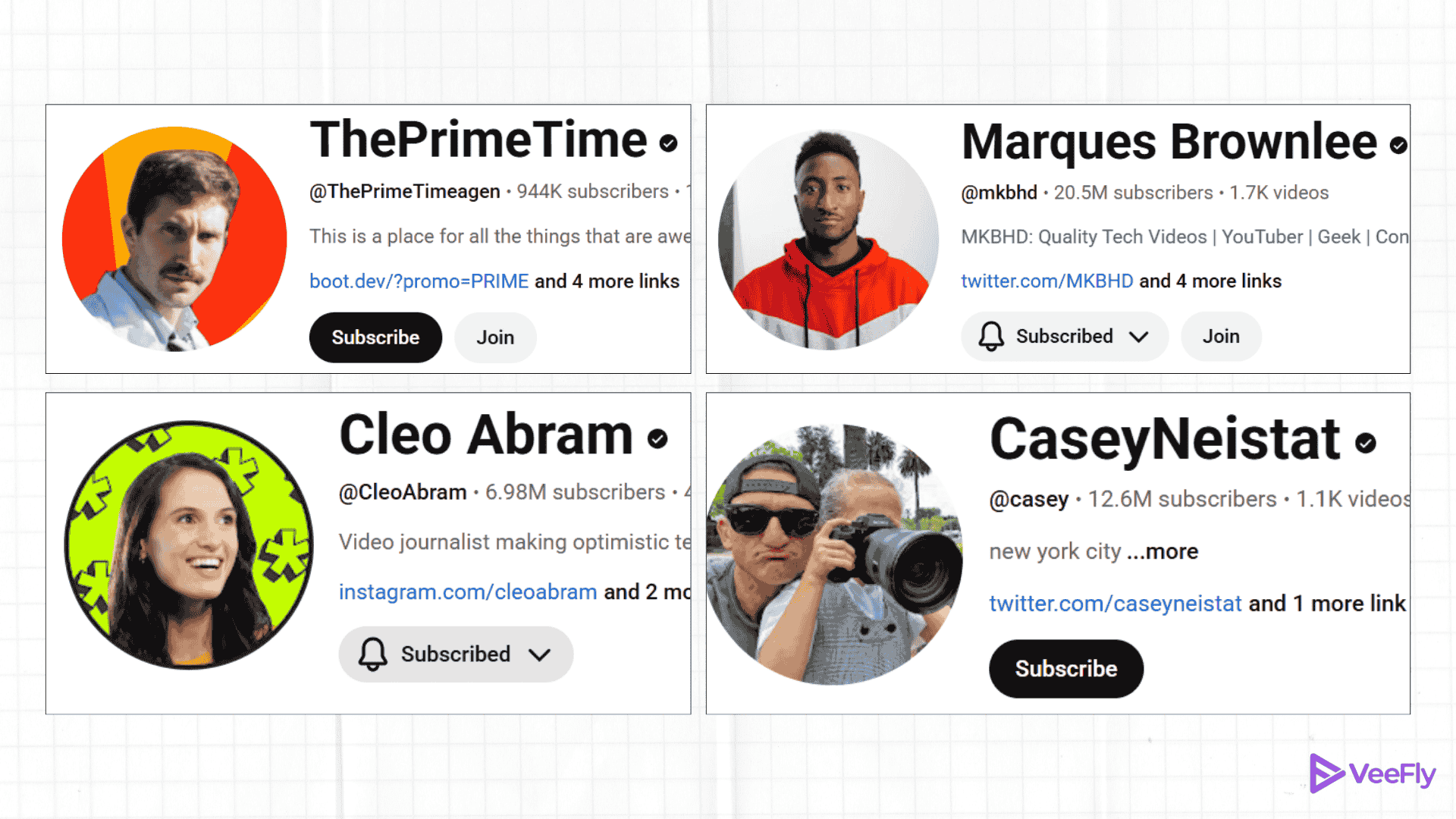
Here are three types of YouTube profile picture examples. You can implement across all social platforms for consistent branding.
Professional Logo

The first example is for YouTubers who want to build their channel as a brand. The logo can be used anywhere, including websites, social media platforms, and merchandise. It establishes your brand identity and makes your channel recognizable.
Your face only

For creators, their face is their currency, and they can utilize it to gain quick visibility as well. For creators like Marquess, a famous internet personality, their face can serve as a front for further monetization opportunities. You can try this if you share the same vision.
Avatars
![]()
You can create your avatar, resemblance, or something that makes it easily recognizable for the viewers. For example, NetworkChuck and his beard combination are enough to make people recognize his videos. However, the calamity occurs when Chuck has a clean shave! Chuck, if you are reading this, don’t get any ideas.
Conclusion
By now, you must have realized that your YouTube profile picture size plays a big role in determining whether or not viewers will click on your channel and subscribe. Ensure your profile picture looks credible and is appealing enough to depict what your channel is about. Use the YouTube profile picture maker if you need assistance. It is a tiny but essential step in attracting more views and subscribers. If you are a beginner who is trying hard to set up your fanbase, you must promote video on YouTube.
If you’ve already covered this step and are unsure about the content you want to post on your channel, here are the top 9 video content ideas to increase views and expand your channel’s reach.
Frequently Asked Questions
Q1. What are the guidelines for YouTube profile picture?
Ensure the uploaded image has proper dimensions, file type, and complies with YouTube community guidelines.
Q2. How to fix a blurry YouTube profile picture?
Start by optimizing the image in a ratio of 1:1 and 800×800 px. Choose the right format and image size (under 2 MB), remove contrasting filters, and avoid over-editing. Use AI tools to refine and reupload.
Q3. How do I see full-size profile picture on YouTube?
You can go to the profile image, right-click, and open the image in a new tab. Or you can change the profile URL from “s88” or “s176” to “s1024” to view larger image.
Q4. What size is YouTube Profile Picture?
Use dimensions of 800 x 800px and choose a high-resolution (2MB) file type (JPG, PNG, BMP, or GIF) to display quality details, making your design center.
Q5. Does my profile picture affect views?
Yes, it affects the algorithm, but not directly; instead, it helps with recognition, first impression, professionalism, and maintaining the channel theme.
Q6. How Do I Crop My YouTube Profile Picture?
You can use online tools to crop your YT profile picture. You cannot upload a profile picture with the wrong dimensions.


